Last Sunday, I joined in the company of about 40 people in a Modernteering adventure (a word to describe an “orienteering” adventure where the control points are examples of modernist architecture) across Brisbane.
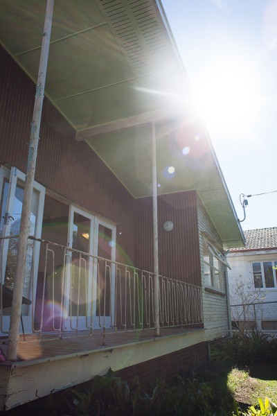
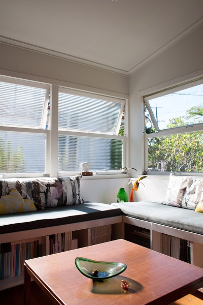
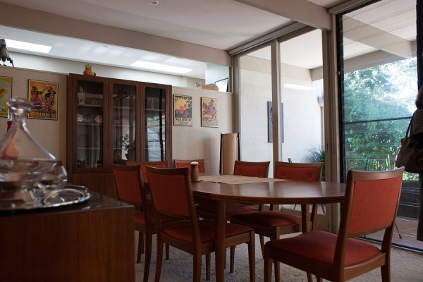
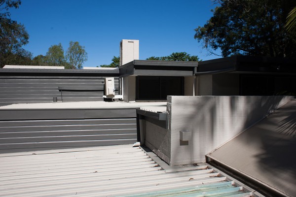
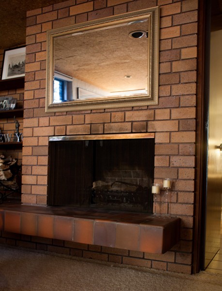
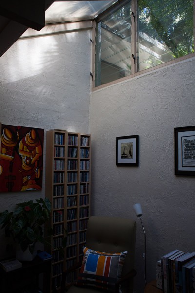
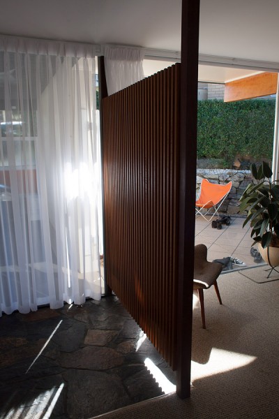
The starting point was a house in Aspley. When I heard the adventure was starting in Aspley I knew it would be a good day. There are so many nice houses in Aspley and every time I drive through Aspley I go down another street looking for those perfect modernist houses or design elements that are scattered over Aspley. This house was one of them and and the owners have spent the last couple of years working on the inside and are about to start working on the exterior. My favourite feature of this house was of course the balustrade but I did love the soaring sloped ceilings and the delightful lounge area below the corner window.
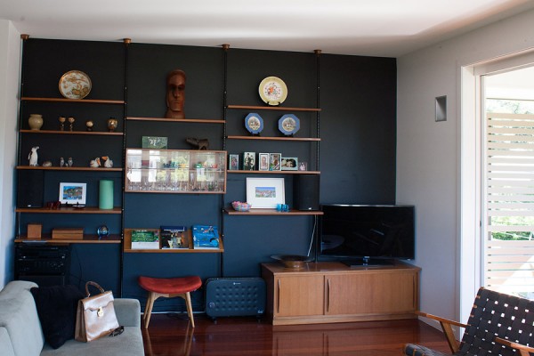
The next house was in Ashgrove and was an example of a  extension/conversion of a classic Ashgrovian post war timber house with a slightly modernist bent. The wall storage system was just gorgeous.Â
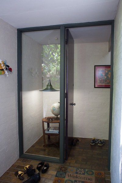
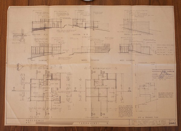
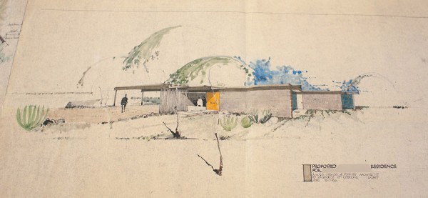
Next up was Tarragindi to a house that I would cross the river for. Yep, I would become a southsider for this house. It is a house that was perfectly designed for the site it sits on. Perfectly sub-tropical and modern and Brisbane. It had lines, Â more lines and more lines so much so that I Â just kept getting lost in my admiration of the lines of the house. I would stand outside the house or in a corner of the room just absorbing all those lines.
The house was designed by an architect as his family home and was built in two stages as money allowed completion of the build. The current owners bought it from the architect about a year ago and one of the best things about the house tour was that the architect was actually there to talk about the house, the design and anything else you wanted to ask. I spent a lot of time pouring over the plans trying to soak up as much of the house as I could.
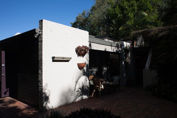
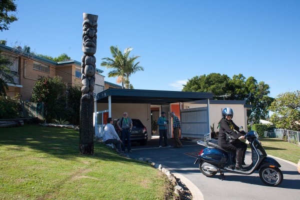
The last house of the tour was in Carina for a house designed by Donald Spencer and the current occupants are the third to own it, the house is quite “Palm Springs Modern” in style and when you look at the other houses in the street it would have been something really quite out there and I’m sure that the residents of the street at that time would have looked through their net curtains and wondered what that house was. I can almost here them whispering “It has now dining room!”, “The kitchen is just two tiny strips of bench behind a three quarter height wall that backs onto the living room”, “They have to eat outside!”
It really is a house and a half and it seems quite fitting that one of the current owners is a Tiki Carver! I adored, all the glass walls which brought so much light into the house and the way in which the house just flowed from one room to the other and from outdoors to indoors.
The last point was lunch, where we enjoyed delightfully kitsch sandwiches with fillings such as chicken and pecan, salmon (tinned of course) and two others that I can’t remember now. All on white bread of course!
The tour was run by Chris at Australian Modern and it was a fantastic morning out not only to explore delights of Brisbane but also the chance to catch up with other Brisbane bloggers (Brismod and Carmel of the now hibernated Make Mine Mid-Century) and to meet a whole bunch of new people who all have a place in their heart for Modernist architecture and design in many forms.
I’m very much looking forward to the next MAD (Modernist Architecture + Design) house tour when ever it happens 🙂
Hey,
great photos! I think everyone was smitten with the Tarragindi house.
I can’t wait for the next tour either! It was so much fun!
Back to the grindstone tomorrow, sister.
You did have a lovely day.
Love mum
I just love your photographs of the day. It was also so lovely to finally meet you in the flesh! xx
Hi Helen, The photos are great. So wish I could join you all one time. Thanks for your comments on the WAC commercial. xx Katherine
The first images are at our house at Aspley. Helen mentions she liked the balustrade. We have actually replaced it recently, but as architects we were very specific about the task, and think we have done a better job than any other we have seen at reworking the 1960’s aesthetic while meeting current codes which have more stringent requirements about the size of openings and heights for climbable horizontal elements. You can see an image of our balustrade design here http://snaparchitects.tumblr.com/image/58501309375 as well as more images of the house here http://www.cloud-dwellers.com.au/-/22L.html
Cloud Dwellers